
Hello everyone, welcome back to my blog. This is the part-2 of the Highcharts and Spring boot series, where we will implement different charts using Highcharts library. If you missed the part-1 then you can check here.
In part-1, we have discussed the line chart of a single series/line but in this post, we will discuss the line chart with multiple series/lines.
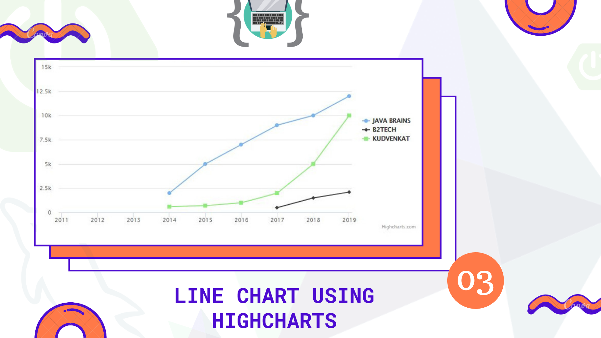
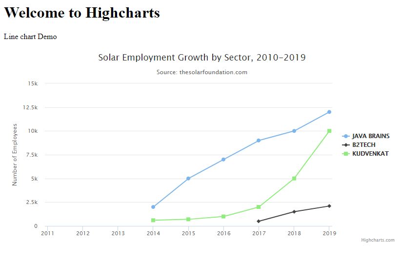
Let’s say we have a dataset of different youtube channels subscribes count on a yearly basis from 2011 – till this year 2019

Now we have to represent this in visually/graphically. So we are going to use the Line chart from the Highcharts library. Let’s see how we can achieve this using Highchart and Spring boot. I will use the same project which we have used in the part-1
Following query is to create the table in MySQL database
CREATE TABLE multiple_line_chart
(
    id INT NOT NULL PRIMARY KEY AUTO_INCREMENT,
    name VARCHAR(45) NOT NULL,
    subscribers VARCHAR(10),
    year VARCHAR(4) NOT NULL
);
Make sure to add entries/records to the table which we have created above.
Next step is to create a respective model class inside the model package
MultipleData.java
package in.bushansirgur.highcharts.model;

import javax.persistence.Column;
import javax.persistence.Entity;
import javax.persistence.GeneratedValue;
import javax.persistence.GenerationType;
import javax.persistence.Id;
import javax.persistence.Table;

@Entity
@Table(name = "multiple_line_chart")
public class MultipleData {

	@Column
	@Id
	@GeneratedValue(strategy=GenerationType.IDENTITY)
	private Integer id;
	@Column
	private String name;
	@Column
	private String subscribers;
	@Column
	private String year;
	public Integer getId() {
		return id;
	}
	public void setId(Integer id) {
		this.id = id;
	}
	public String getName() {
		return name;
	}
	public void setName(String name) {
		this.name = name;
	}
	public String getSubscribers() {
		return subscribers;
	}
	public void setSubscribers(String subscribers) {
		this.subscribers = subscribers;
	}
	public String getYear() {
		return year;
	}
	public void setYear(String year) {
		this.year = year;
	}
	@Override
	public String toString() {
		return "MultipleData [id=" + id + ", name=" + name + ", subscribers=" + subscribers + ", year=" + year + "]";
	}

}
Next step is to create a repository/interface inside the dao package to access the data from the database
MultipleDataDAO.java
package in.bushansirgur.highcharts.dao;

import org.springframework.data.jpa.repository.JpaRepository;
import org.springframework.stereotype.Repository;

import in.bushansirgur.highcharts.model.MultipleData;

@Repository
public interface MultipleDataDAO extends JpaRepository<MultipleData, Integer> {

}
Next step is to autowire the dao interface inside the controller and create a handler method to map the data
HomeController.java
@Autowired
MultipleDataDAO multipleDataDAO;

@RequestMapping("/multiplelinechart")
	public ResponseEntity<?> getDataForMultipleLine() {
		List<MultipleData> dataList = multipleDataDAO.findAll();
		Map<String, List<MultipleData>> mappedData = new HashMap<>();
		for(MultipleData data : dataList) {

			if(mappedData.containsKey(data.getName())) {
				mappedData.get(data.getName()).add(data);
			}else {
				List<MultipleData> tempList = new ArrayList<MultipleData>();
				tempList.add(data);
				mappedData.put(data.getName(), tempList);
			}

		}
		return new ResponseEntity<>(mappedData, HttpStatus.OK);
	}
The next step is to call the handler method using ajax from javascript. Once the ajax call is done, call a method to draw a chart inside the success callback function.
index.js
$.ajax({
	url: "multiplelinechart",
	success: function(result){
		var formatteddata = [];
		for(var key in result){
			var singleObject = {
					name: '',
					data: []
				}
			singleObject.name = key.toUpperCase();
			for(var i = 0; i < result[key].length; i++){
				singleObject.data.push(parseInt(result[key][i].subscribers));
			}
			formatteddata.push(singleObject);
		}

		drawMultipleLineChart(formatteddata);
	}
});

function drawMultipleLineChart(formatteddata){
	Highcharts.chart('container', {

	    title: {
	        text: 'Solar Employment Growth by Sector, 2010-2019'
	    },

	    subtitle: {
	        text: 'Source: thesolarfoundation.com'
	    },

	    yAxis: {
	        title: {
	            text: 'Number of Employees'
	        }
	    },
	    legend: {
	        layout: 'vertical',
	        align: 'right',
	        verticalAlign: 'middle'
	    },

	    plotOptions: {
	        series: {
	            label: {
	                connectorAllowed: false
	            },
	            pointStart: 2011
	        }
	    },

	    series: formatteddata,

	    responsive: {
	        rules: [{
	            condition: {
	                maxWidth: 500
	            },
	            chartOptions: {
	                legend: {
	                    layout: 'horizontal',
	                    align: 'center',
	                    verticalAlign: 'bottom'
	                }
	            }
	        }]
	    }

	});
}
Next step is to run the main class and open up the browser, enter the URL http://localhost:8080 you will see the chart as shown in the below.
That’s it for this post, i hope this post helped you in someway or the otherway, if it did then please share this post with your friends and colleges. If you have any queries regarding this post then please leave your questions in the comment section down below or you can email me to bushan@bushansirgur.in and i am happy to assist you.
Thank you! Happy coding! 🙂
